2021 - 2024 · Careem · Quik
Three years designing Careem Quik
I joined when Careem Groceries was an MVP with implementation problems and very basic features. I left when it was processing 10,600 orders a day.
A small team of two or three product designers built this, and I was the only one there for all of it.
Timeline
2021
Launch, moving fast
2022
First corrections, Audits, Research
2023
Building the system, Implementing templates and the Aurora DS
2024
Rebranding v.2 and revamp of the whole app
2021
The MVP
During the 2020 pandemic Careem was struggling. Back then its only service was ride-hailing - and we all know how much they were used during that time, when everyone was at home, quarantining, whether voluntarily or not.
At the time, a clear need emerged: contactless shopping, a service providing everything that one needs quickly and without harming one's health.
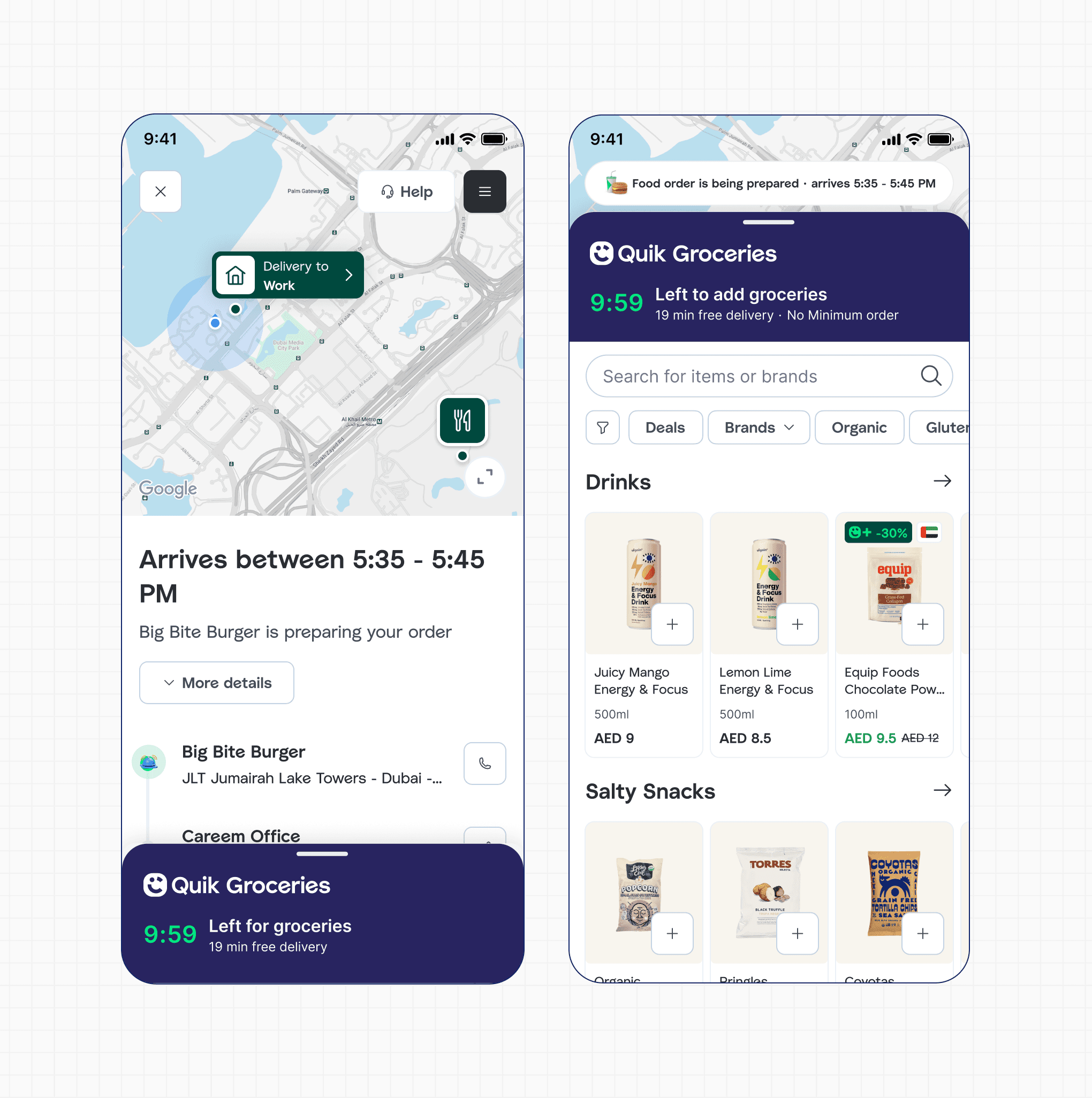
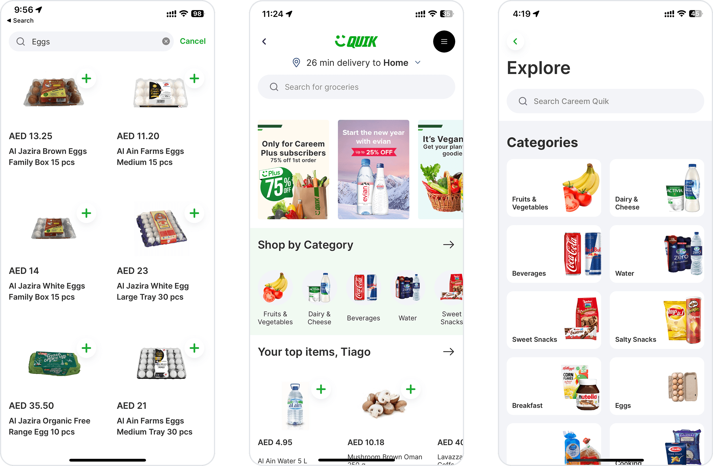
That's how Quik was created - out of a real need and also a niche in the market: Quik had only 2 competitors back then. Quik was built in a fast way, with rudimentary design and features, no design system, no regional precedent, no handover. The product had to feel native to Careem's super-app while building its own identity dark UI, green palette, a visual language that had to be right from day one.
150 orders/day. New user conversion started at 6%.
I joined at the very end of this stage: we shipped, observed, and took notes.
2022
What the MVP got wrong
The product worked, in the sense that orders came through. But it had been built for speed, and it showed everywhere.
We could have stopped and rebuilt the foundations. We didn't. With growth targets on the table and two competitors moving, I chose to ship against the biggest drop-offs first and take on the structural debt knowingly. That debt came due in 2023 — but it bought us a year of growth we'd otherwise have spent rebuilding.
To find the drop-offs I ran a heuristic audit, pulled what stakeholders across ops, commercial and CX already knew but hadn't written down, and ran end-to-end usability tests with customers and non-customers.
Three things came back:
- The homepage wasn't doing any work. Users scrolled straight past it — the Buy Again carousel was the only part they used.
- Browsing was exhausting, and it was almost the only way to find anything. You opened the Categories list, picked the closest category, then scrolled. No filters, no sorting.
- Search only matched exact phrases. There was no semantic layer, so "garbage bag" returned nothing.
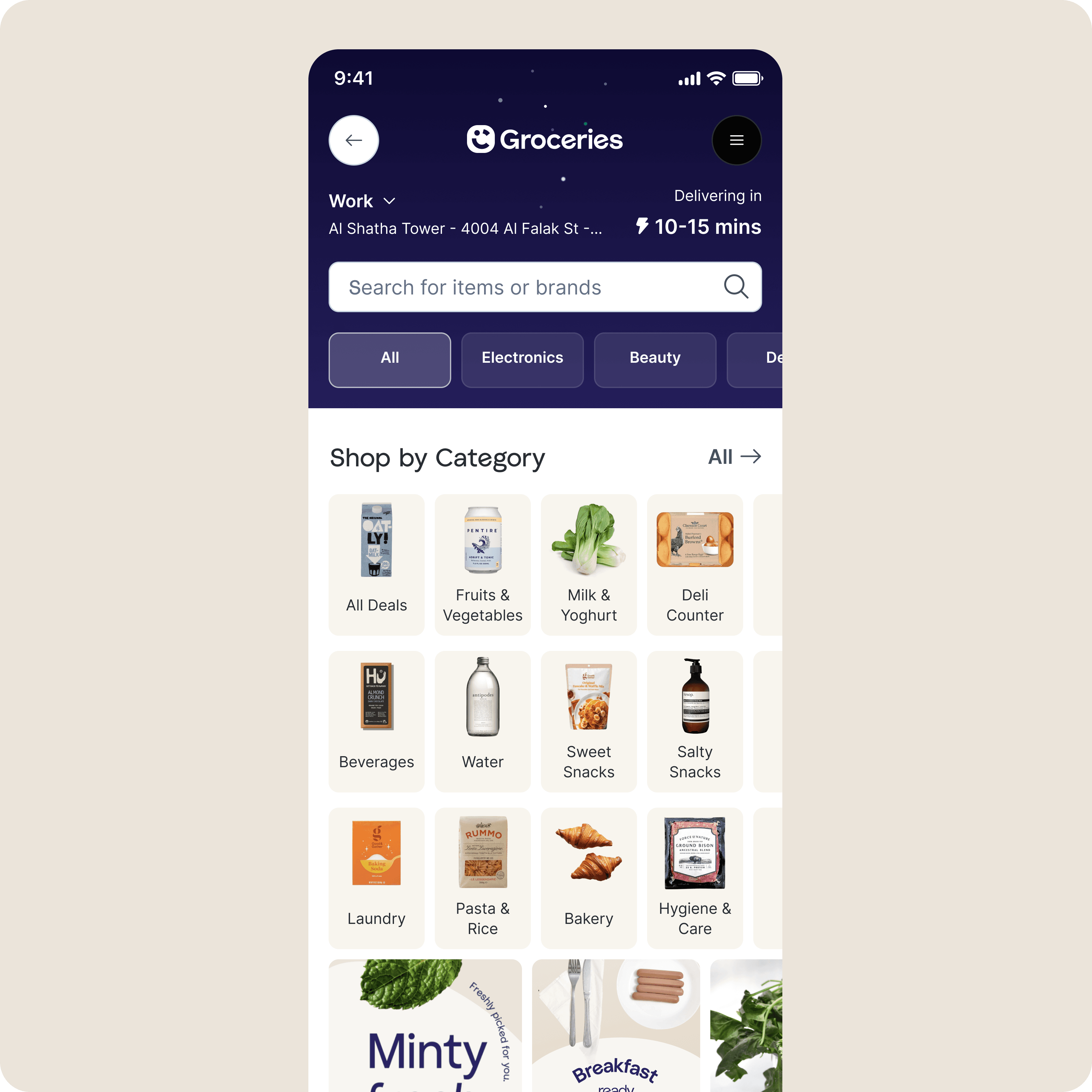
We focused the fix on the homepage. We rebuilt the Shop by Categories section, shipped onboarding, added a banner system with real guidelines behind it, and made design QA a standing process. Search got semantic matching, so 'garbage bag' finally returned garbage bags. Browsing by category from the homepage went from 20% to 40%. The rest went into a plan of basic fixes we knew we'd have to come back to.
2022
Fix the dark stores first
Quik was scaling faster than its darkstores could physically keep up. Orders arrived quicker than staff could receive stock, put it away and pick it — which meant no amount of work on the customer app was going to fix delivery times. So we stopped shipping customer-facing work and went to fix the floor.
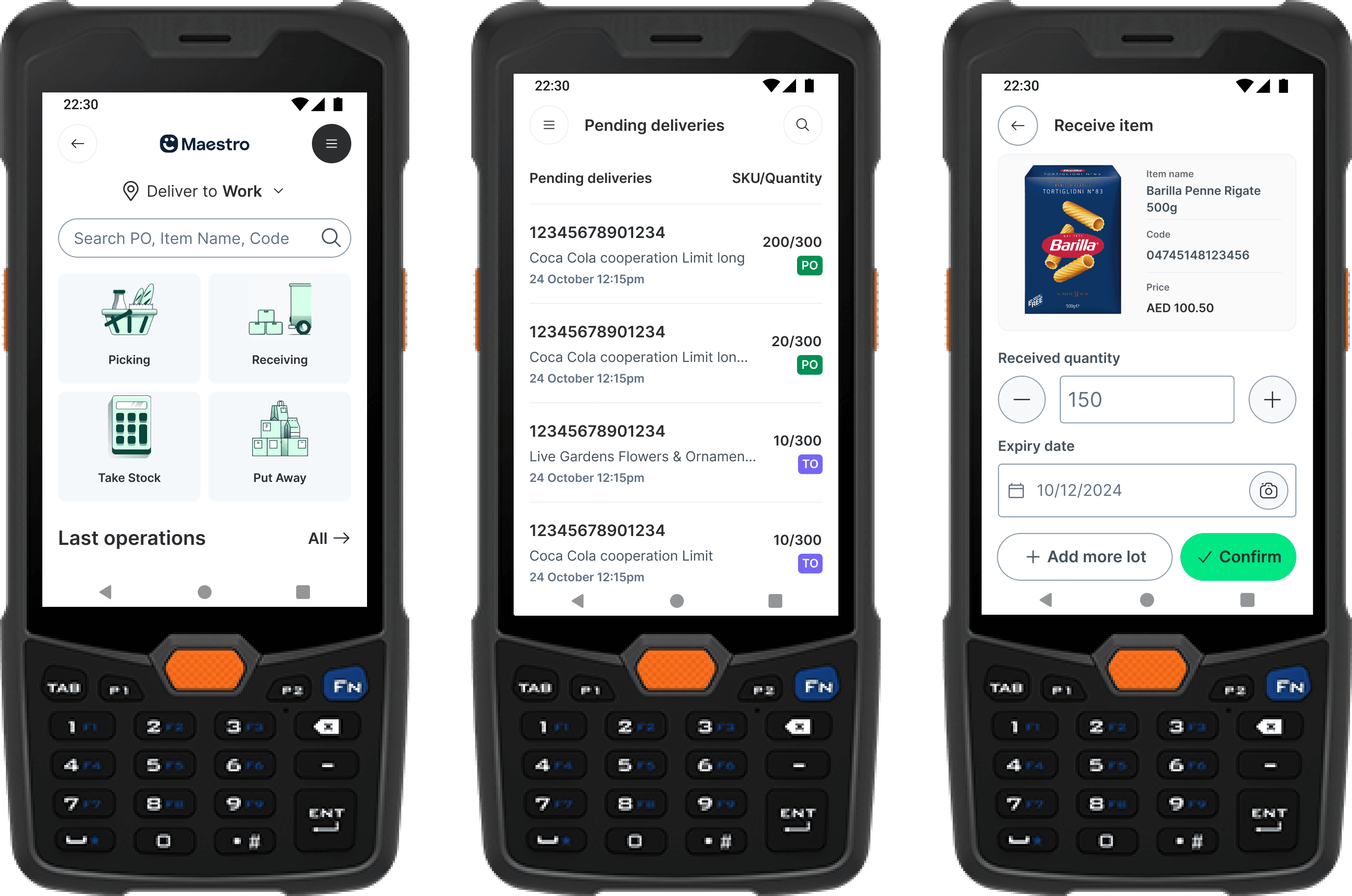
Maestro is the app that runs a darkstore: everything physical between a pallet arriving at the back door and an order leaving the front. I led the design.
We built it in sequence — picking first, because it runs hundreds of times a day and sits directly on delivery time. Receiving second, because it's the harder problem.
Harder because receiving is exact work: quantities against a purchase order, lot numbers, expiry dates. One delivery took between one and four hours, counted by hand and keyed into Oracle, and came out wrong often enough that Quik showed items as out of stock while they sat on a shelf.
So we started with research — fifteen interviews, run by a colleague on the ground in Dubai while I designed from another continent. The one that changed everything was a 23-year-old on his first job in the city, running the existing tools entirely from muscle memory, ignoring every instruction in them, because he read almost no English.
Which is a problem when the work is exact and all of it is text.
So we made it visual. Product photography instead of names, recognised icons instead of labels, colour as status — and text kept only where a number had to be exact.
Time to receive an item fell 55%. The job went from two or three people to one.
80% reduction
in mistakes
55% reduction
in time to receive an item
500 min saved
per week in one dark store
2-3 → 1 person
per receiving shift
2023
Paying the system tax early
Careem's apps had drifted apart. With a rebrand coming, every screen we owned outright was a screen someone would have to redo by hand.
So the Groceries and Food design teams went looking for the pages we'd independently solved twice — and turned them into shared templates on the Aurora design system.
The trade is real: a templated pattern is one you can no longer tune for groceries specifically. A grocery basket needs more items visible per screen than a food order does, and shared components don't bend that far. We took the trade deliberately, a year before the rebrand would have forced it on us.
Adoption went from 15% to 95%.
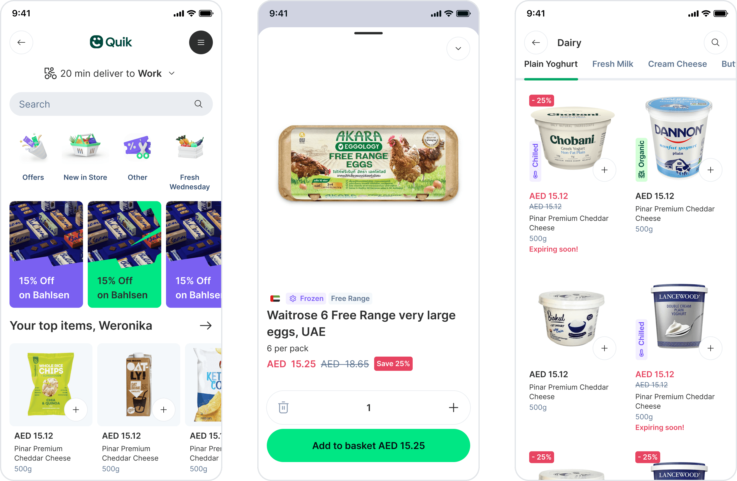
Same components, grocery density.
2023
The option we didn't take: Reconsidering Full Selection
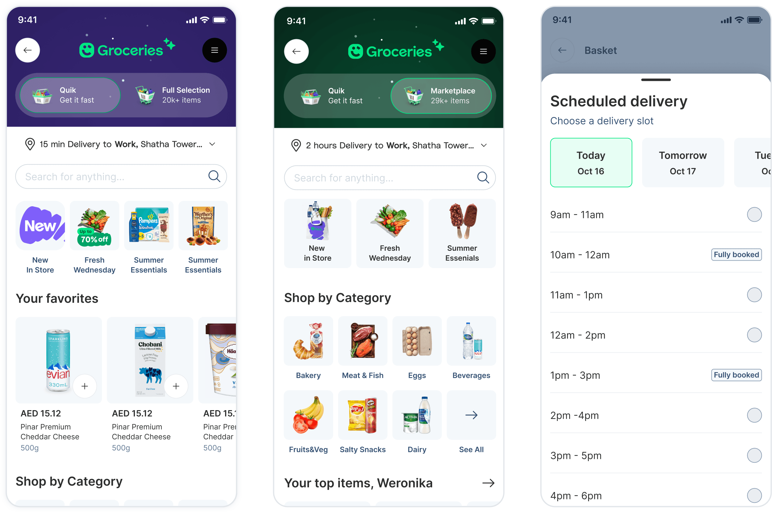
The pitch was Full Selection: open Quik up to a far wider catalogue, with next-day delivery for anything a darkstore couldn't hold. More SKUs, bigger baskets, more GMV. Everyone could see the number.
Along with UXR we ran exploratory research into how customers actually held the service in their heads — three mental models, interviews across the region, a service blueprint of what each one touched.
What came back was hard to argue with. Immediacy and predictability outranked everything, price included.
I switch apps if availability is lacking.
When I order, it's like a replacement of me going downstairs. It's for the convenience.
I do not like scheduling delivery; it's not a use case for me.
I will not use the scheduled service. When I come to Quik, I KNOW that all items will be delivered to me in under 30 min.
Which turned Full Selection from an opportunity into a red flag. It would have diluted the one thing Quik was for. Someone opening Quik isn't shopping.
So we didn't build it. Given the cost and the lack of enthusiasm from customers, we kept speed as the differentiator and added around it; the strategy moved to integrating the marketplace with Quik Groceries instead.
2024
The revamp
By 2024 Quik had three years of habits built into it — people knew where things were. Then the positioning changed. Quik was to become more premium: refined, elevated, built around quality rather than price.
We didn't phase it. The rebrand and a full revamp of the app shipped together.
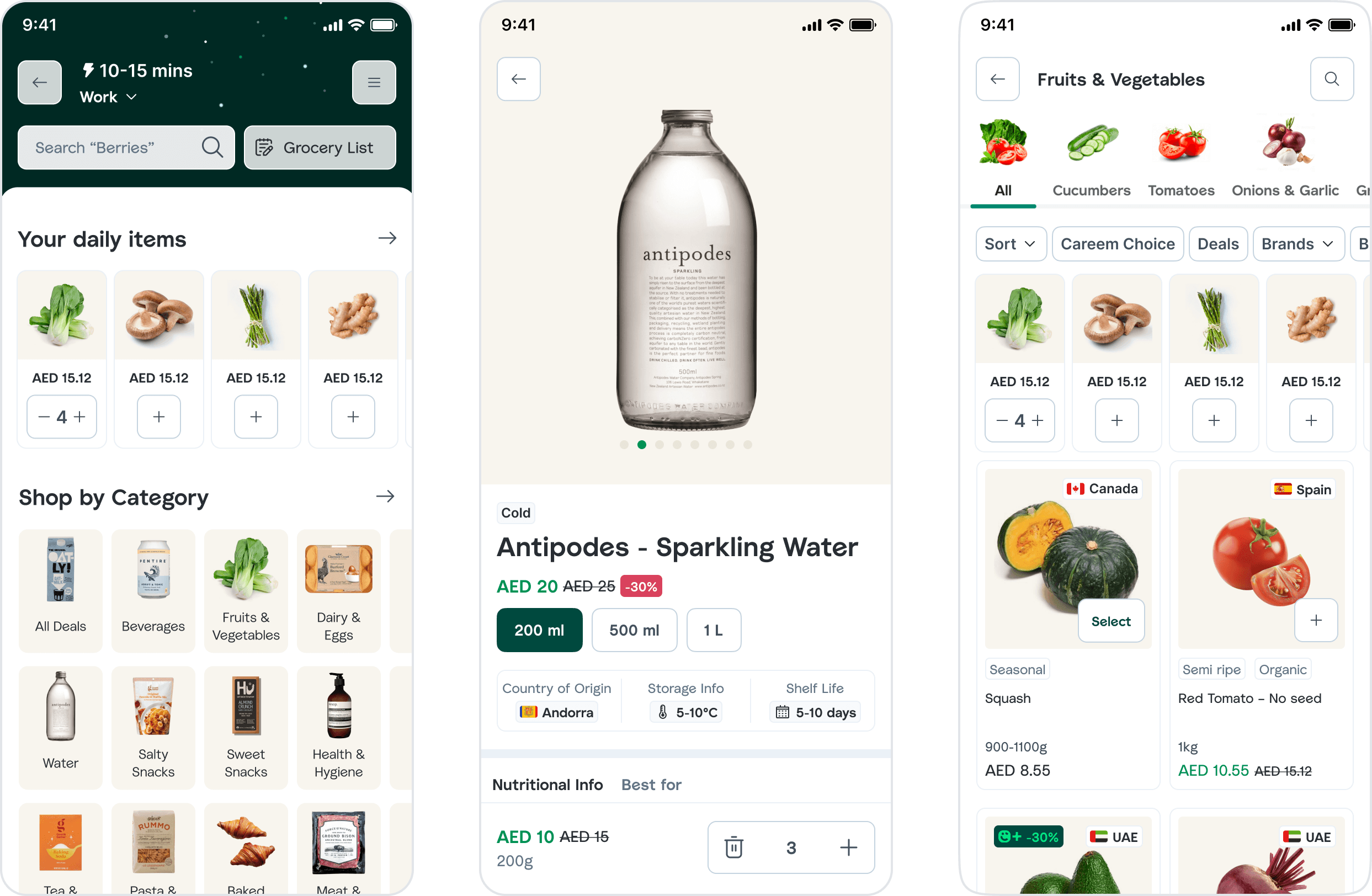
Product cards stopped leading with price and started leading with the product — what it actually was, how good it was. And the revamp gave us cover to ship everything that had been deferred as “later”: product enrichment, a real browsing experience, variants.
Then we renamed it. Quik became Careem Groceries, and customers were perplexed. Nothing about the service had got slower — but speed had dropped out of the name and out of the marketing, and people read that as a promise being withdrawn. We had spent so long talking about quality that we quietly stopped saying the thing customers chose us for in the first place.
We rolled the name back to Careem Quik.
The template work from the year before is what made a revamp that size affordable at all.
We came out at 10,600 orders a day.
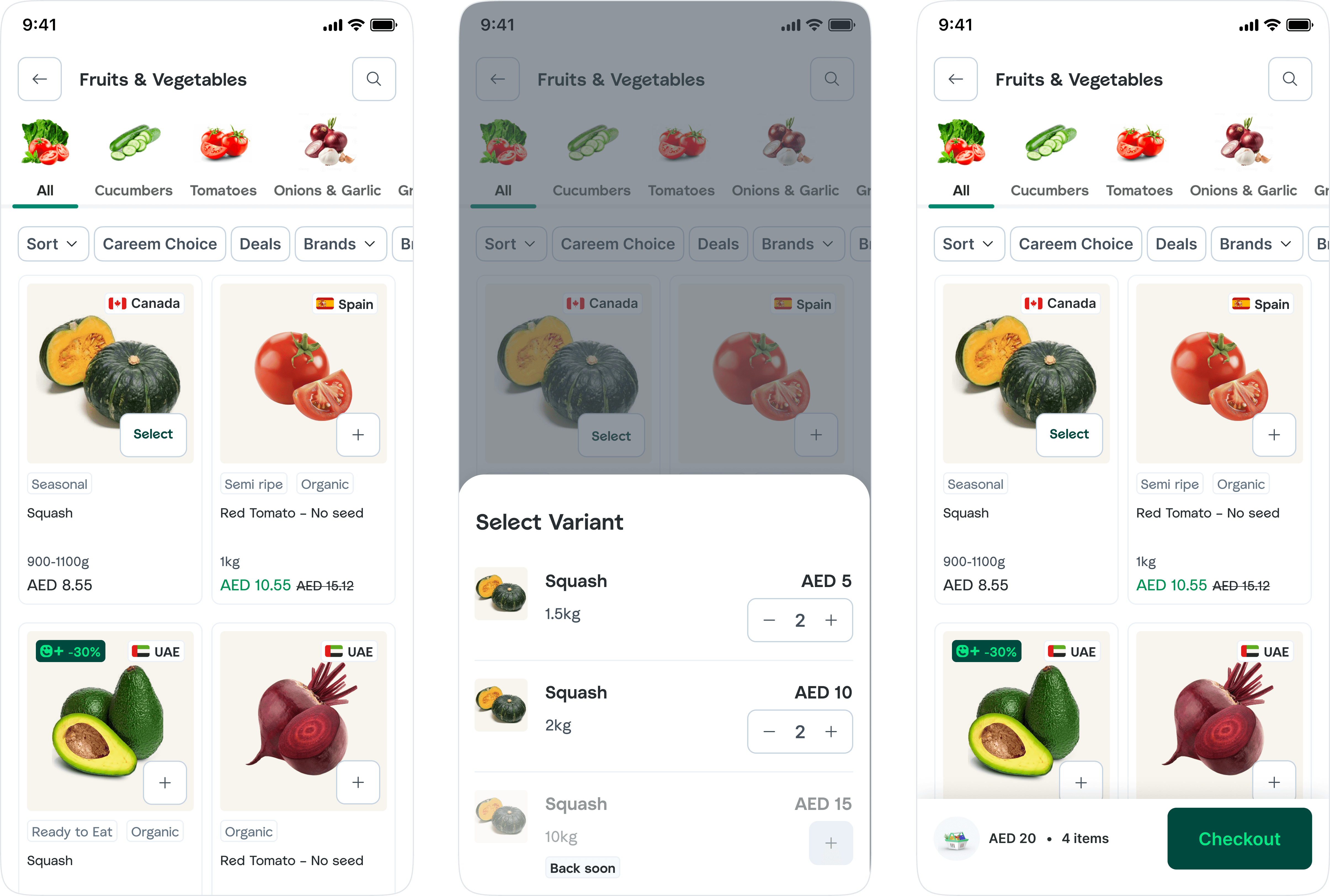
Outcome
Numbers throughout the years
150 → 10,600
orders / day
29% → 56.1%
30-day retention
0 → 30
darkstores opened
1 → 3 cities
Dubai, Abu Dhabi, Riyadh
Reflection
What I'd do differently
I may come across as sentimental, but this is one of those projects a designer gets very attached to — building it almost from scratch, seeing the progress, knowing what it took to create in the pre-AI era.
What I'd do differently: I'd have looked at the darkstores sooner. We spent months carefully optimising a customer app whose delivery times were being decided somewhere none of us were looking.